Typography and composition
In MSF communications, the most important thing is the message.
Our fonts and our style of composition should match the tone of our communications, which should be legible, powerful, clear, ordered and precise.
In MSF communications, the most important thing is the message.
Our fonts and our style of composition should match the tone of our communications, which should be legible, powerful, clear, ordered and precise.
The main font we use is Atlas Grotesk.
The Atlas Grotesk font family has seven styles, each is available both plain text and italics.
Atlas Grotesk Thin
Atlas Grotesk Thin Italic
Atlas Grotesk Light
Atlas Grotesk Light Italic
Atlas Grotesk Regular
Atlas Grotesk Regular Italic
Atlas Grotesk Medium
Atlas Grotesk Medium Italic
Atlas Grotesk Bold
Atlas Grotesk Bold Italic
Atlas Grotesk Black
Atlas Grotesk Black Italic
The use of this font, along with its style of composition, graphically identifies MSF OCBA’s values.
The Atlas font will only be used for external communication materials: publications, MSF website, videos, pieces for social networks, etc.
For all other materials, Word documents, Power Point and Prezi presentations, etc., we will use the Arial font, since it is installed on most computers.
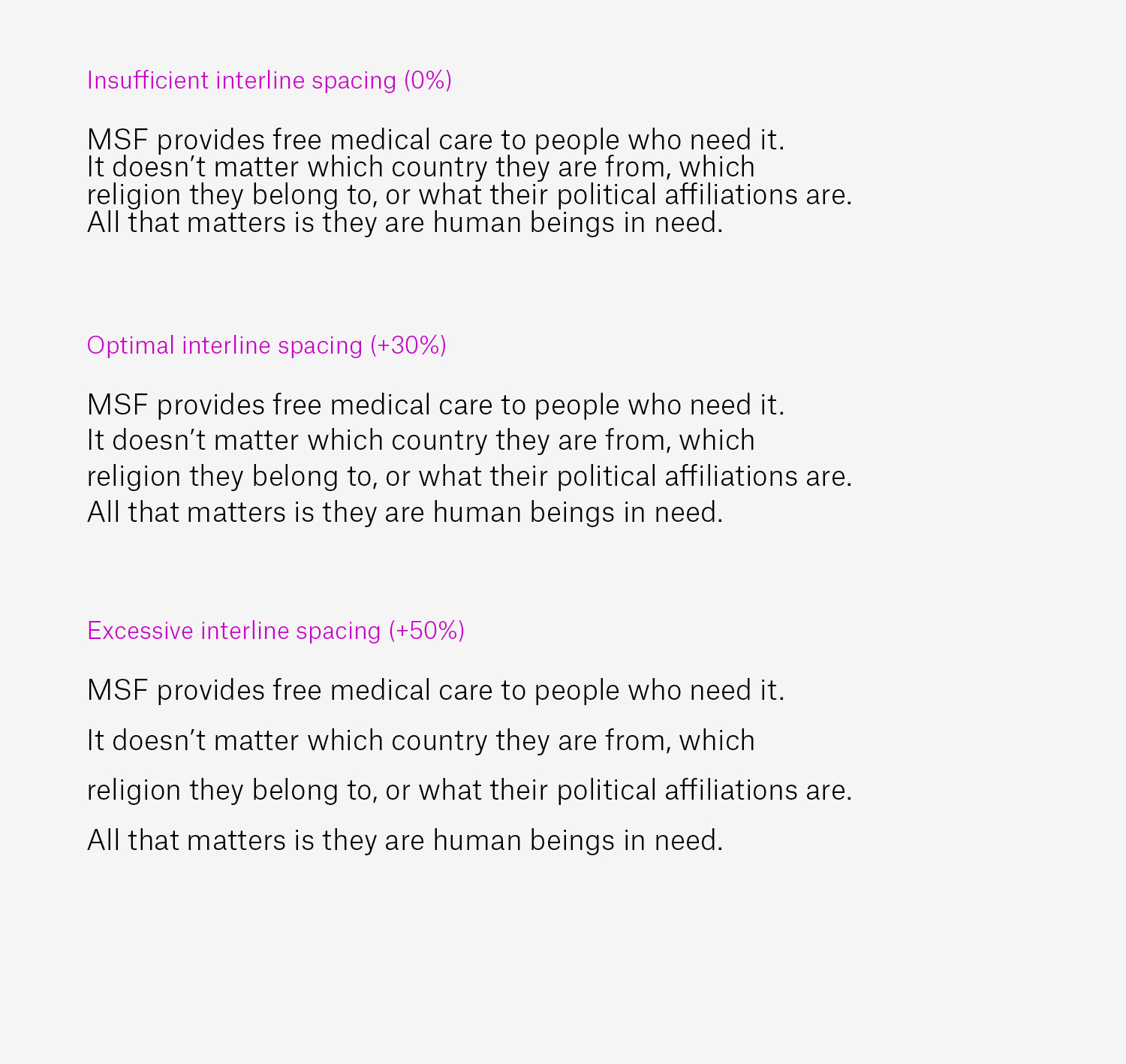
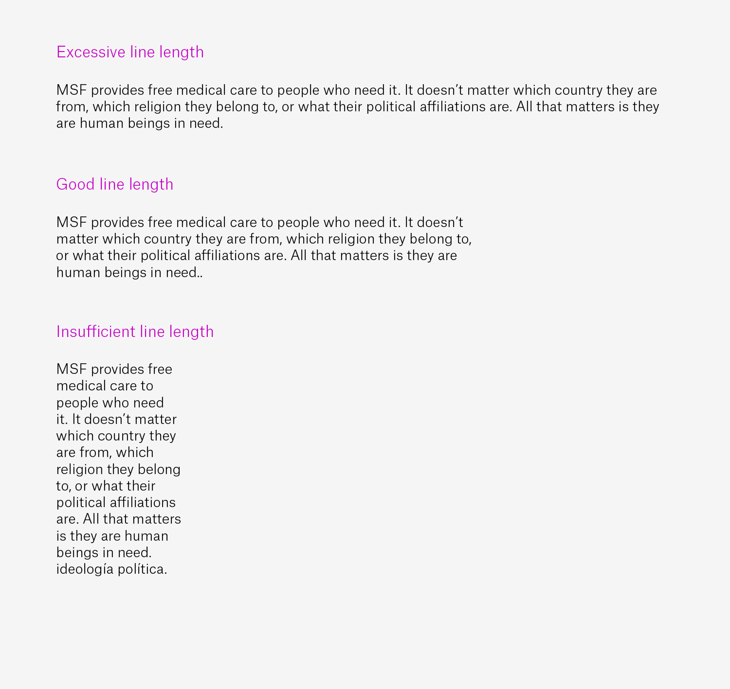
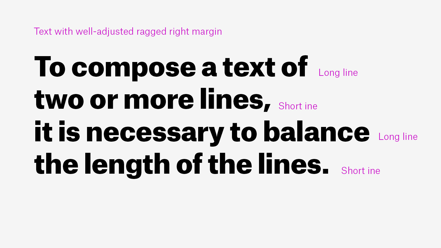
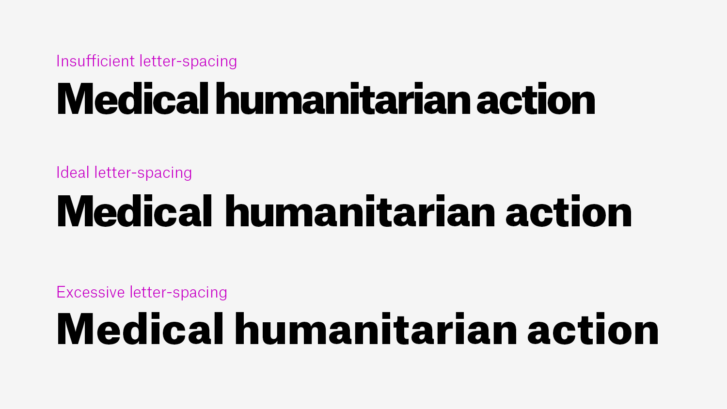
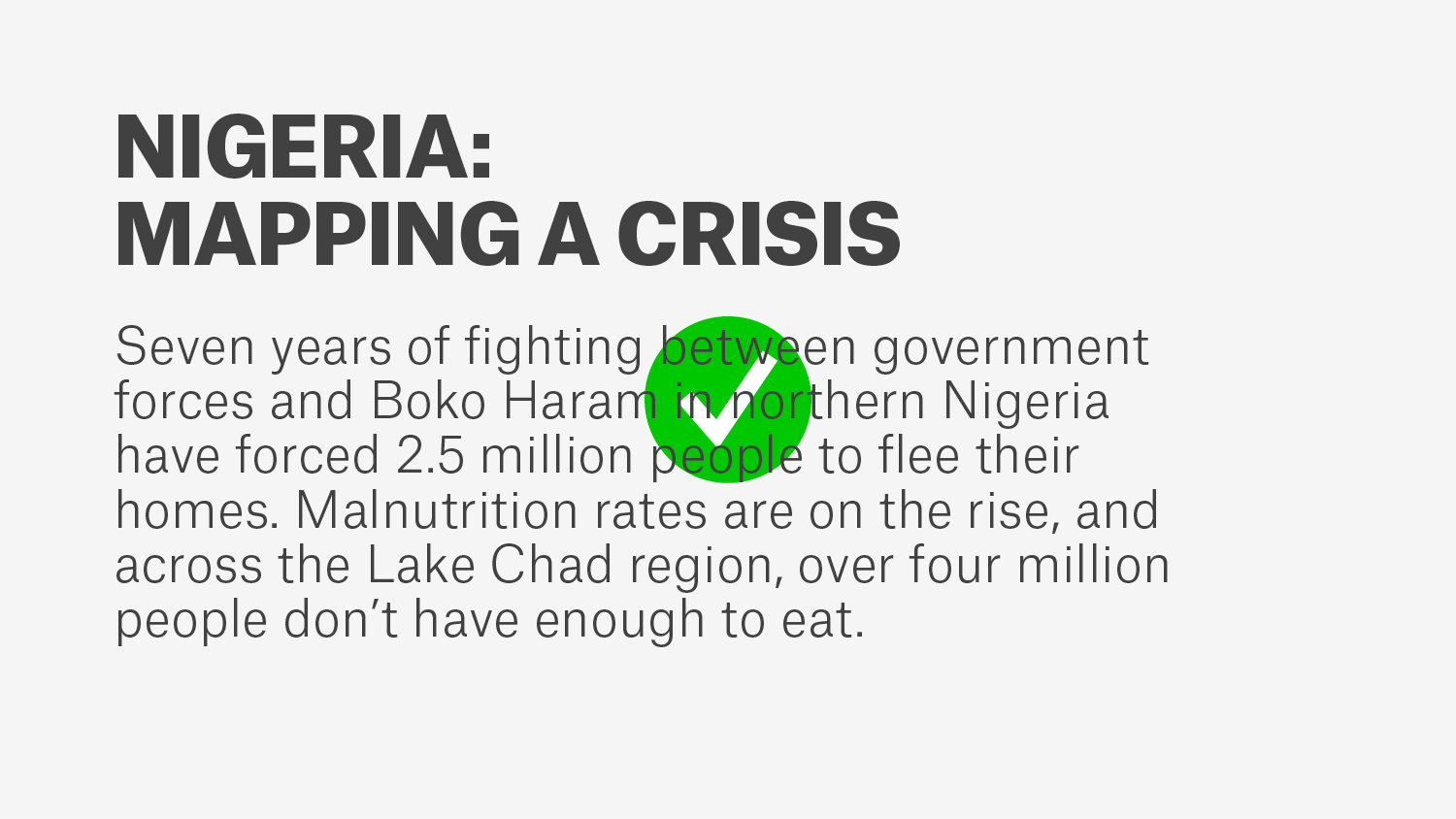
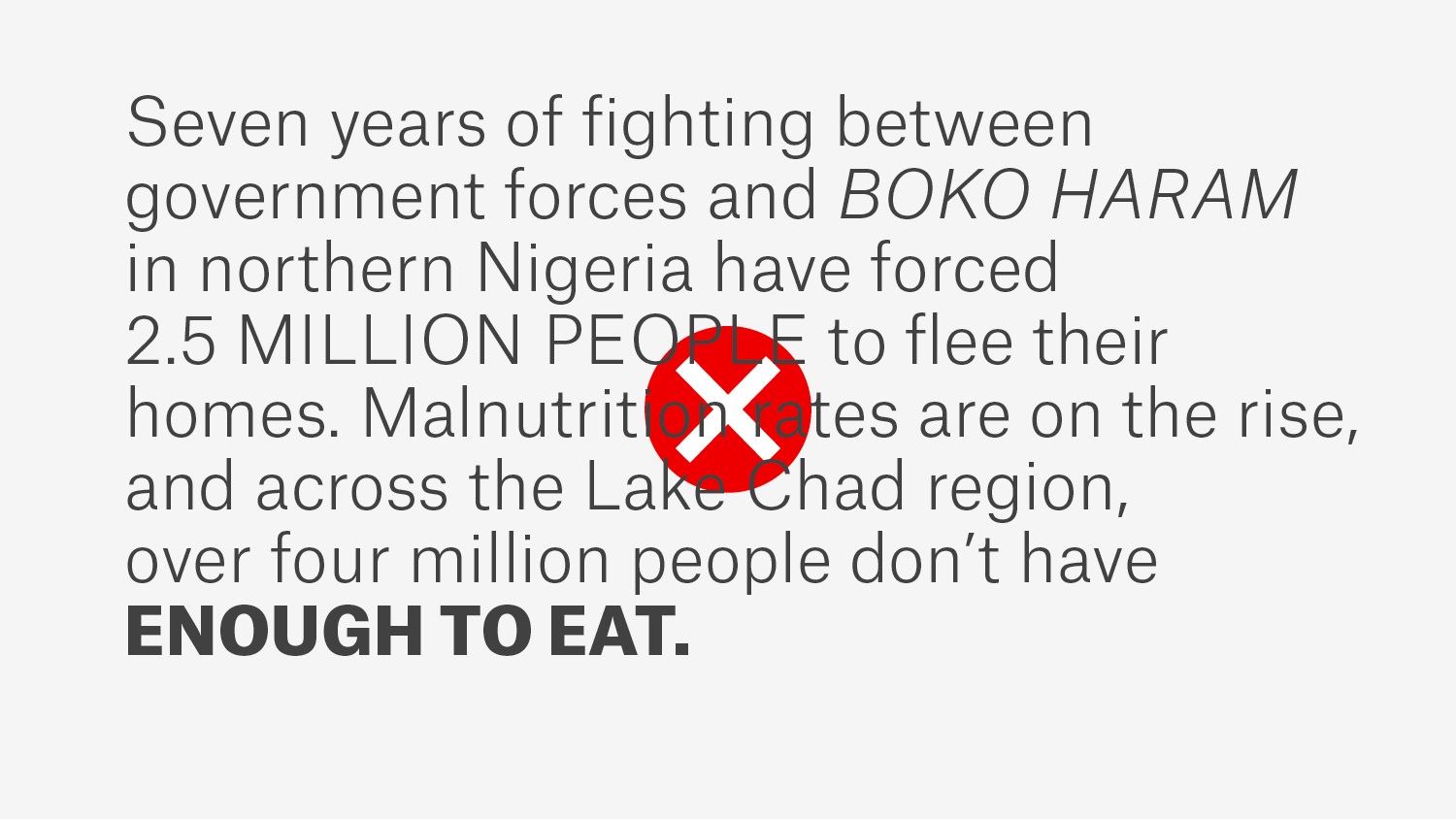
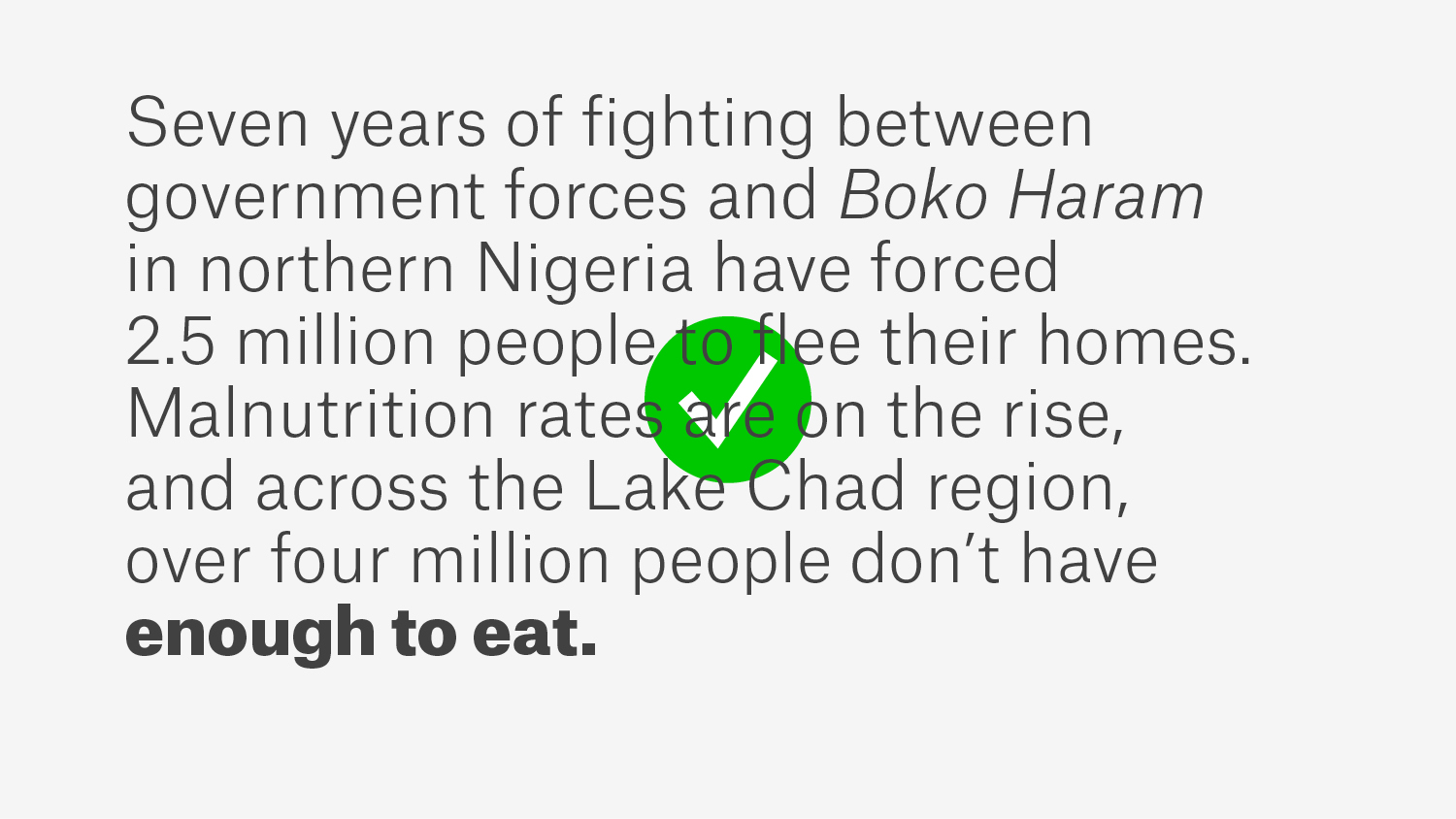
All texts should be left-justified, and with font size, line spacing and length that make the text easy to read:
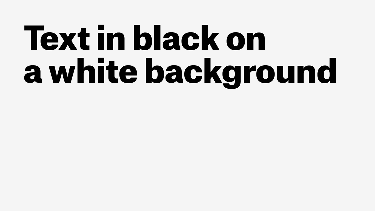
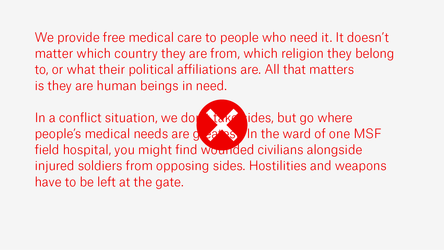
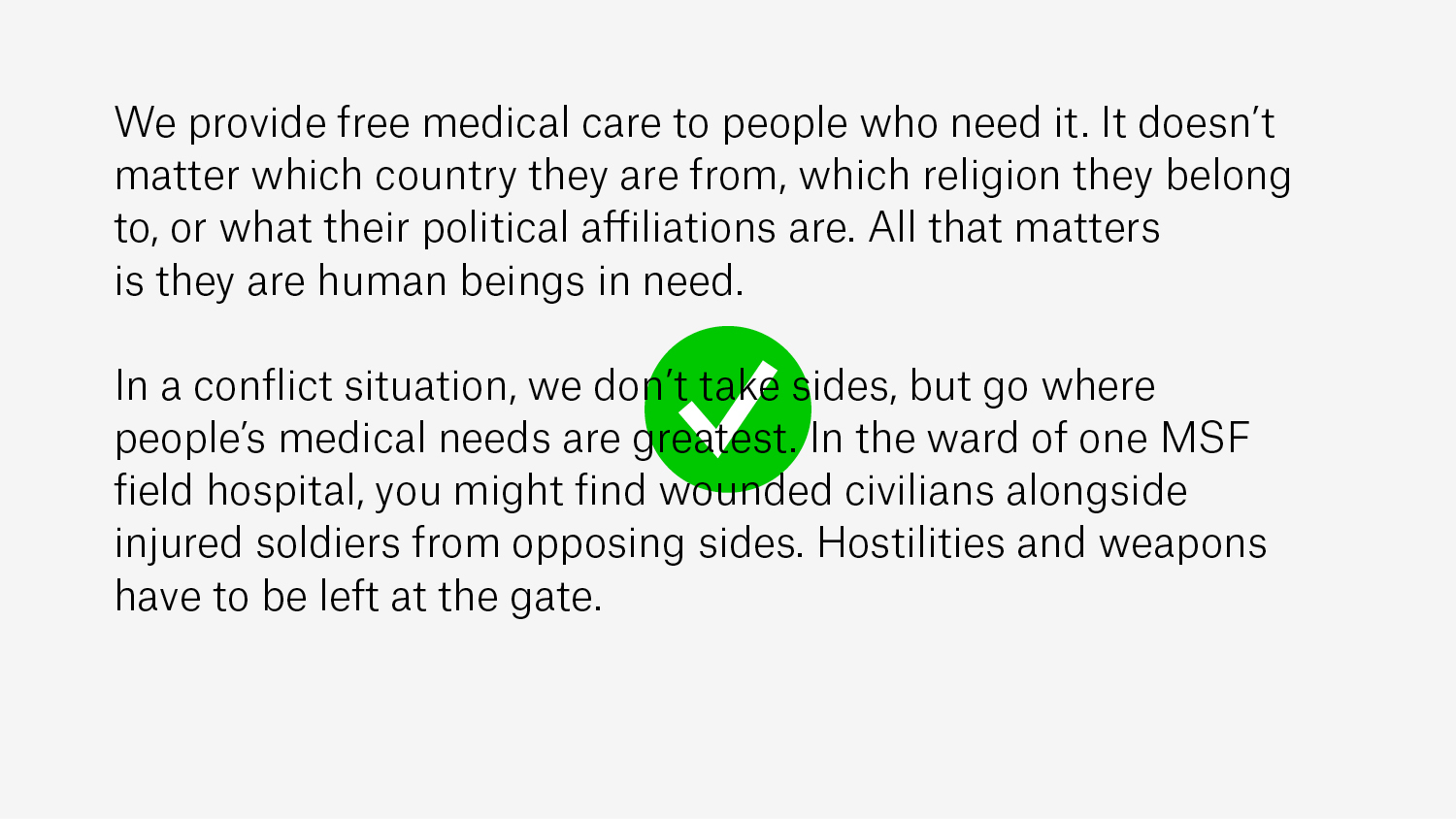
Text should be black on a white background for ease of reading.
| #414141 |
| R65/G65/B65 |
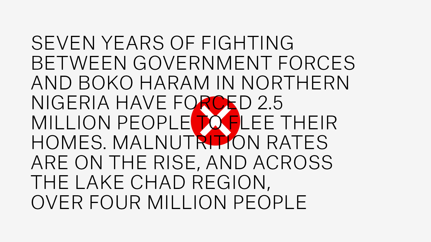
The hierarchy of upper and lower case within a piece of text should be clear and simple:
The font we use is available in six styles: Thin, Light, Regular, Medium, Bold and Black.
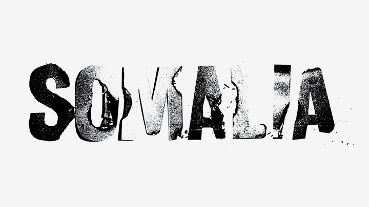
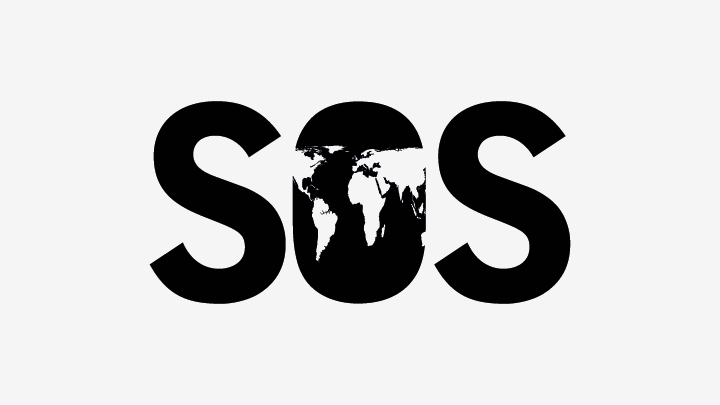
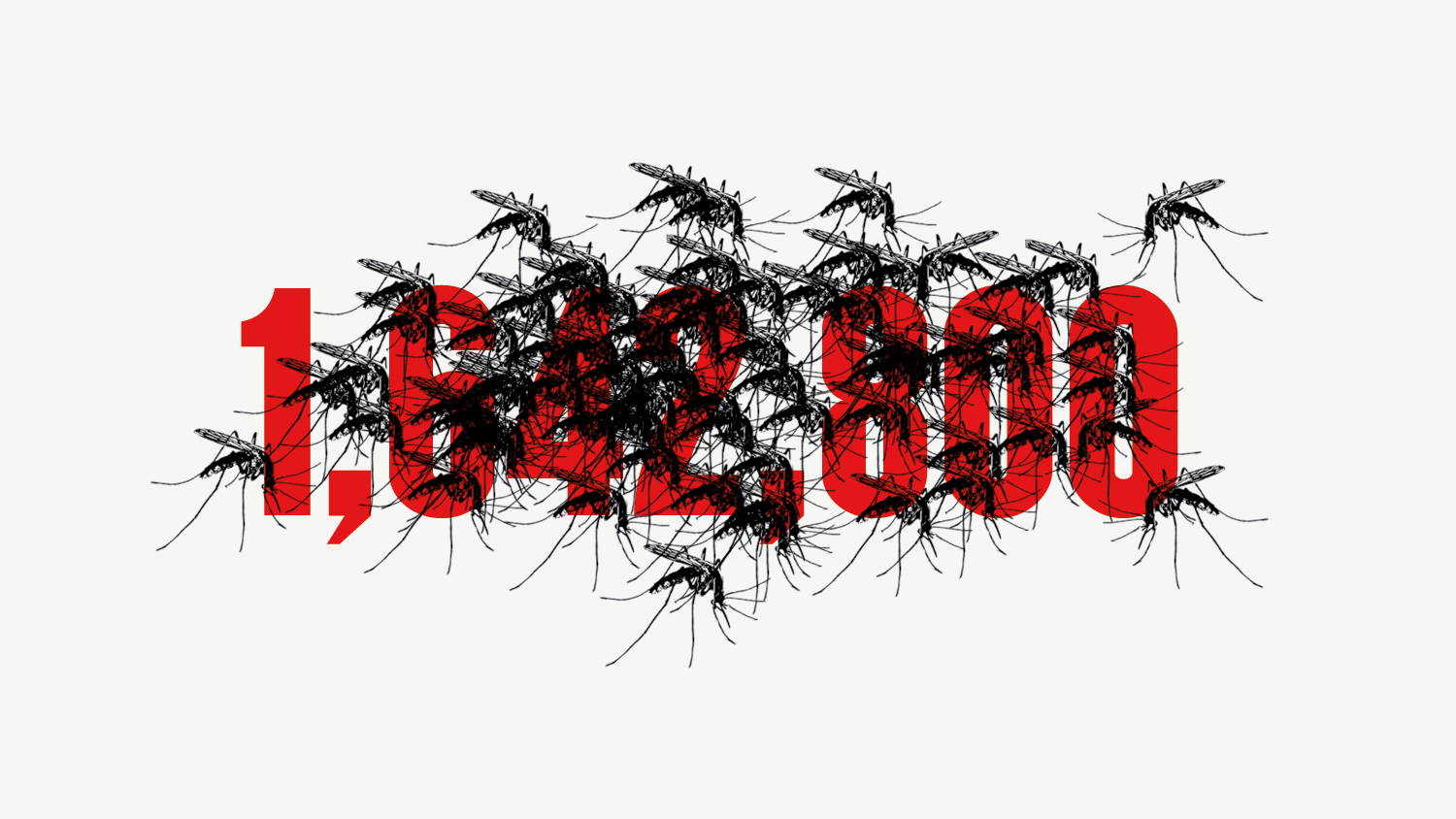
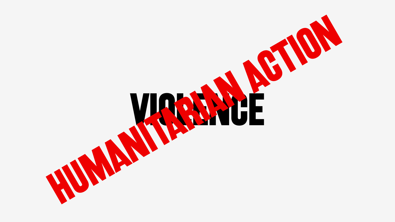
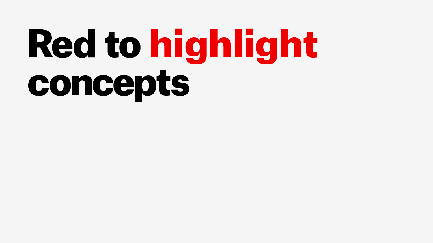
In those cases when it is considered appropriate to compose a word or short message using a special style, this text can be considered an illustration and any typeface can be used.
Any text that accompanies this type of text illustration should be created with Atlas Grotesk following the standard guidelines.