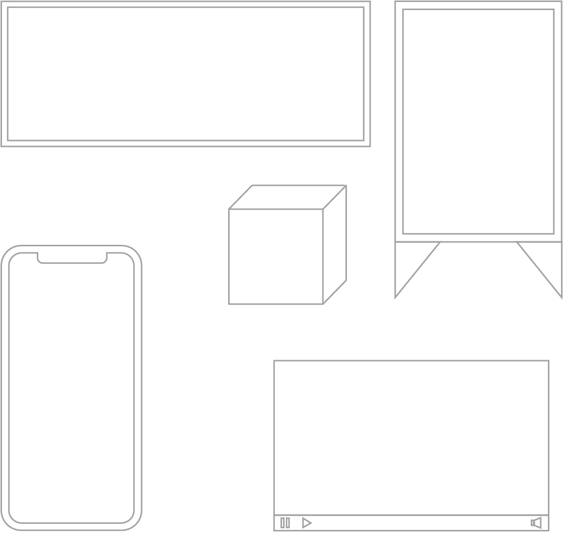
Structure
By using a consistent graphic structure, our work will be identifiable as MSF even without the logo or symbol.
This structure can be adapted to any medium, format or display.
The following steps should be taken to structure and identify content for all types of media.
1
Identity frame
The colour white is a part of our identity, and is as important as our logo:
- On physical media, a white frame should be left around a design. The size of the frame will vary according to the context.
- In videos, a white background should be used in the opening and closing frames.
- White should be used for headers, footers, text backgrounds and/or page margins in web or interactive formats.
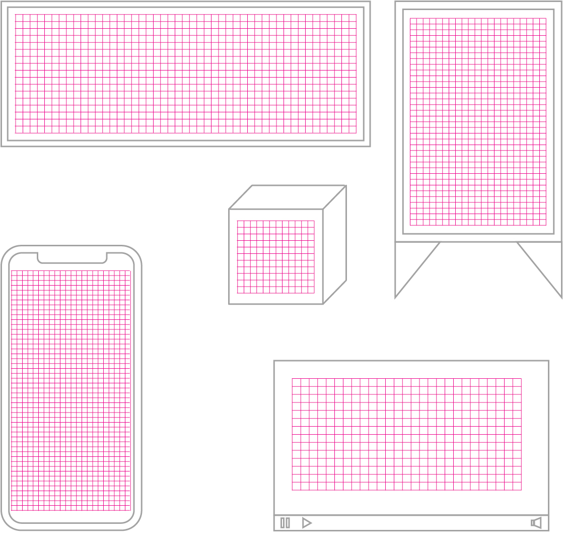
2
Grids
Position information in a clear and orderly way:
- The layout inside the frame should be well defined by using a grid.
- The grid will vary according to the individual needs of each design.
3
Logo application
The logo or symbol should appear within the margins of one of the four corners of the frame:
- The size of the logo will vary, according to the context, but it should be proportionate and consistent with the dimensions of the frame and should fit well alongside other elements.
- The logo should be positioned on a plain background. It should not be superimposed over images, textures or irregular backgrounds.
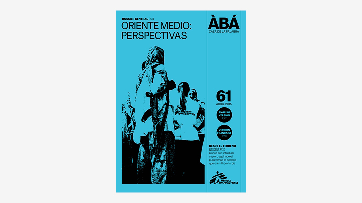
- The logo should be used in all key frames of an application (cover pages, headers, closures, etc).
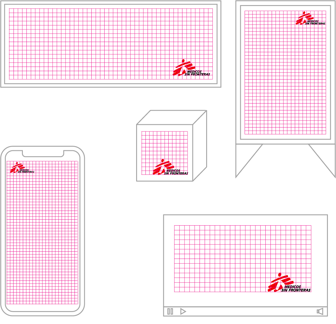
4
Composition
- The message should be positioned in the grid area.
- An order and hierarchy should be maintained according to the message’s requirements.
- The message must be clear and forceful, and we should not overlap information.
- The logo must be kept separate from other elements (at a distance equal to or greater than one-quarter of the symbol’s height).
- The criteria for text composition must be respected.
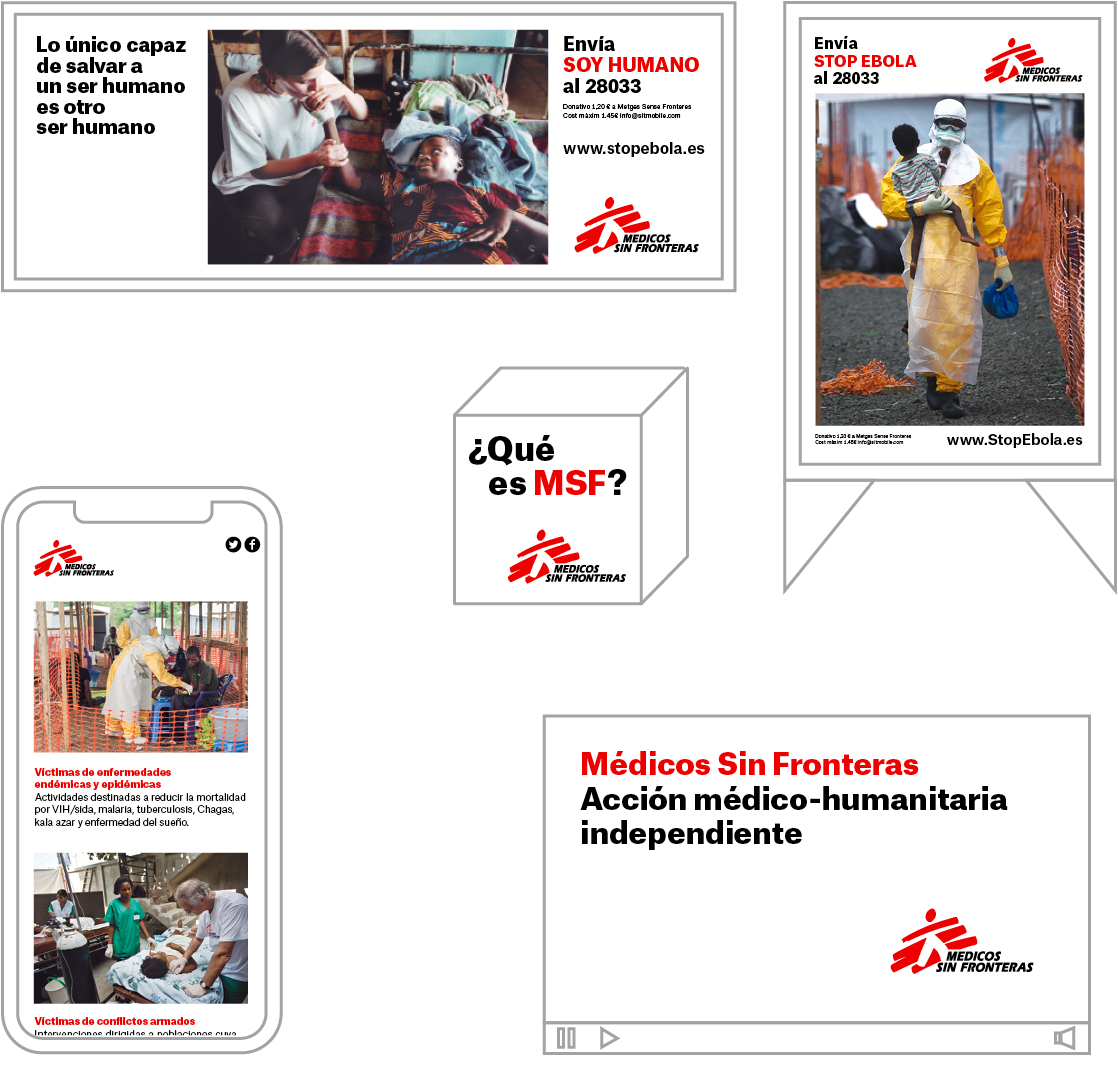
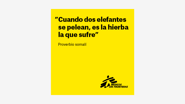
Exceptions in the use of colour
In special cases, the same system can be used with a background colour other than white.
In these cases, the logo is applied in its monochrome version, either positive or negative, depending on the situation.